

The Psychology Behind Site Hoarding Colours:What Works Best?
In hoarding construction, colour plays a surprisingly powerful role. Beyond safety and compliance, hoardings act as key branding and communication tools. For developers, retailers, or councils, site hoarding often forms the public’s first impression – and colour is what they notice first.
Choosing the right colours isn’t just about visual appeal; it’s about psychology. Colours influence emotion and perception. When paired with quality materials like aluminium sign boards, the right colour strategy can transform a site’s impact.
This blog explores how hoarding colours affect viewers and what works best for different project goals.
First Impressions Count
Every building project – whether it’s a housing estate, office block, shopping centre, or school – begins its public journey with hoarding. Long before construction is complete, hoardings are out there, seen by thousands of people daily. And as we all know, first impressions are lasting impressions.
The colour of your hoarding plays a key role in shaping this impression. Whether you're aiming to create a sense of luxury, promote safety, or simply show that something exciting is coming soon, the colours you choose can say it all. With strategic use of colour, your hoarding can reinforce your brand, gain community interest, and turn an otherwise plain barrier into a marketing opportunity.
Understanding Colour Psychology
Colour psychology is the study of how different colours influence human emotions and behaviour. It’s widely used in advertising, retail, branding, and increasingly in hoarding construction. Let’s take a quick look at what some common colours tend to evoke:
- Blue: Often seen as calm, trustworthy, and professional. It's frequently used by banks, tech companies, and developers looking to establish credibility.
- Red: A high-energy colour that grabs attention. It’s often used to indicate urgency, danger, or excitement. On hoardings, it can be used for safety warnings or to highlight action.
- Green: Associated with nature, health, and sustainability. Perfect for eco-friendly or community-led projects.
- Yellow: Bright, cheerful, and eye-catching. Often used to show optimism, innovation, or as a warning colour.
- Black: Suggests luxury, exclusivity, and power. Popular for high-end residential or commercial developments.
- Grey: Neutral and balanced. Often used as a background colour to support other tones or create a sleek, modern look.
These psychological triggers can be very effective when used intentionally. The key is to choose colours that align with the goals and identity of your project.
Colour Use in Hoarding Construction
So how do colour and hoarding come together in real-world projects? Most developers or project managers choose colours based on two main factors:
- Brand Consistency – Using colours from your brand’s palette ensures consistency across all marketing materials. Hoardings become an extension of your business identity.
- Emotional Messaging – Even beyond branding, colours can be chosen to stir certain feelings. For example, using green to convey environmental responsibility or red to communicate urgency and energy on a busy urban site.
And then there’s the matter of quality. It’s not just about picking a colour – it’s about how it looks in reality. That’s where materials like aluminium sign boards come into play. Aluminium is ideal for large-scale printed hoardings because it offers a smooth, sleek surface and holds colour exceptionally well. It ensures that whatever colours you choose, they remain vibrant and professional-looking throughout the project.
Colour Choices for Different Site Objectives
Let’s break down how different project goals influence the colour strategy in hoarding construction:
1. Safety and Visibility
Sites located near roads, public walkways, or high-traffic areas need to prioritise safety. Bright colours like yellow, orange, or red are often used for visibility and to warn of potential hazards. These colours can also be combined with reflective vinyl or safety messages to meet compliance standards.
2. Luxury Developments
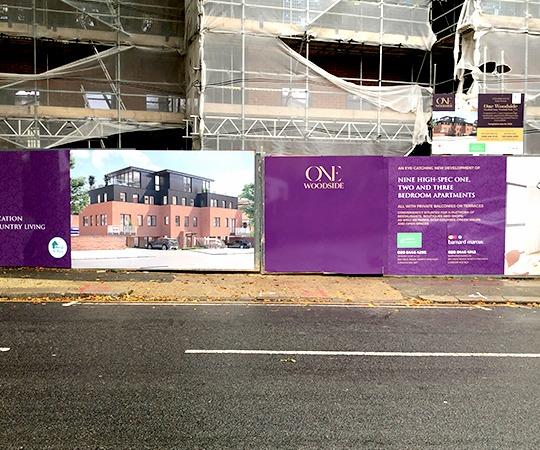
For high-end residential or commercial projects, subtle yet sophisticated colours work best. Think black, charcoal grey, navy blue, or metallic gold accents. These tones create a sleek, modern look that suggests exclusivity and quality. When printed on an aluminium sign board, these colours stand out even more, giving a polished and refined finish.
3. Community or Educational Projects
Projects involving schools, community centres, or healthcare often use lighter, welcoming colours like green, blue, or pastels. These create a friendly, open feel and help reassure the public that the project is there to benefit the wider community.
4. Retail or Commercial Promotions
If your hoarding is doubling up as an advertising board for a new store, hotel, or venue, bold and bright colours are your friend. Eye-catching visuals in red, yellow, or purple can attract attention from a distance and generate excitement.
Each colour palette serves a different purpose — the goal is to match the emotional tone with your brand message and project type.
Examples: Colour Strategy in Action
Let’s look at two brief examples to show how colour psychology works in the field:
- Luxury Apartment Block in Central London
The developers used black hoarding with gold lettering and a matte finish, mounted on aluminium sign boards for a premium feel. The hoarding didn’t just hide the construction site – it reinforced the idea of an exclusive, high-end living experience. - Primary School Redevelopment in the Midlands
Here, the hoarding was painted in pastel green and blue tones with illustrated characters and messages for local children. These colour choices created a calm, engaging environment and reassured parents that the school was being upgraded for the better.
Both projects used colour to communicate – one aimed for elegance and status, while the other focused on warmth and community connection.
The Material Matters – Why Aluminium Sign Boards Are Ideal
You can choose the perfect colour scheme, but if your hoarding material can’t hold the colour, it won’t deliver the impact. That’s where an aluminium sign board comes in.
Aluminium offers several benefits for hoarding construction:
- Durability: It’s weather-resistant, won’t warp, and can withstand harsh conditions.
- Professional finish: Aluminium has a smooth, sleek surface ideal for high-resolution graphics and vibrant colour printing.
- Lightweight and easy to install: Making it practical for temporary or semi-permanent hoarding.
- Eco-friendly options available: Recyclable and reusable, which appeals to sustainability-conscious developers.
This material allows your colour choices to truly shine. Whether you're going for subtle sophistication or bold impact, aluminium ensures your hoarding delivers maximum visual appeal.
Conclusion
Colour matters. In hoarding construction, it’s more than a design choice — it’s a tool for communication. The right colour can draw attention, convey a message, strengthen brand identity, or reassure the local community.
By understanding colour psychology and aligning it with your project’s aims, you can transform hoarding into a memorable asset. Printed on premium materials like aluminium sign boards, colours appear vibrant, professional, and long-lasting.
For developers, site managers, and marketers, this is a chance to add real value. Hoarding Print Company is here to help you make that impact — one colour at a time.
